There are more than 2000 OTECs in Chile. OTEChile is a consultancy group that helps individuals and organizations that want to create an OTEC in Chile. They conduct their training through synchronous e-learning classes adjusting to clients’ schedules. We were the first approached by one of its founders to redesign its Brand Identity and improve its online presence.
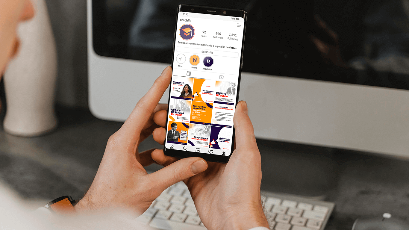
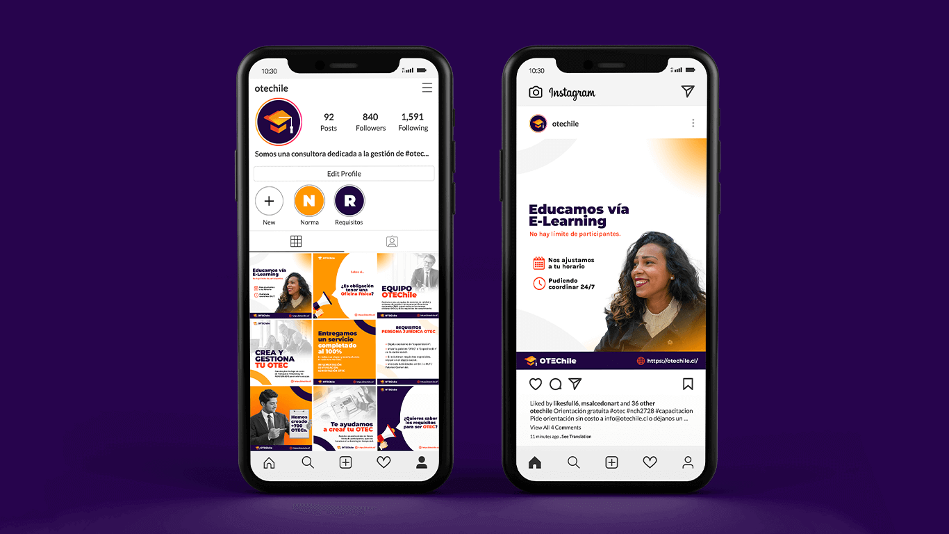
> Start building their brand strategy. Redesigning their Socials Accounts styles, and doing an audit of their website.
> Increasing engagement across popular online destinations for training groups, such as LinkedIn.
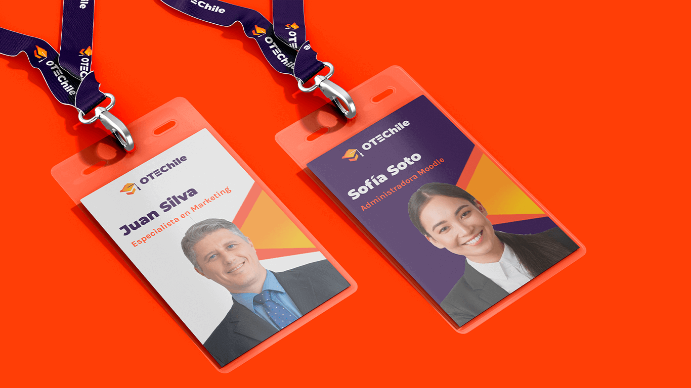
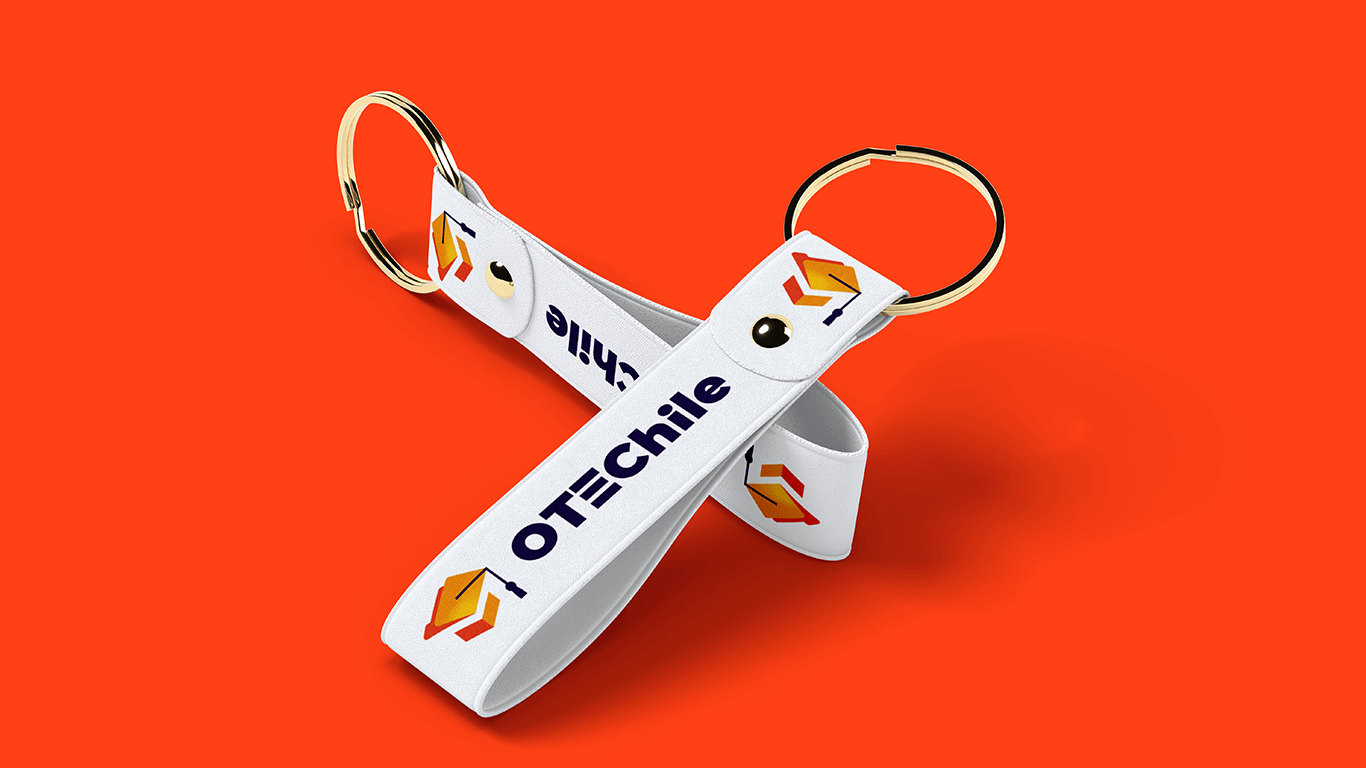
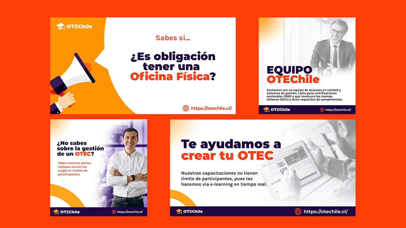
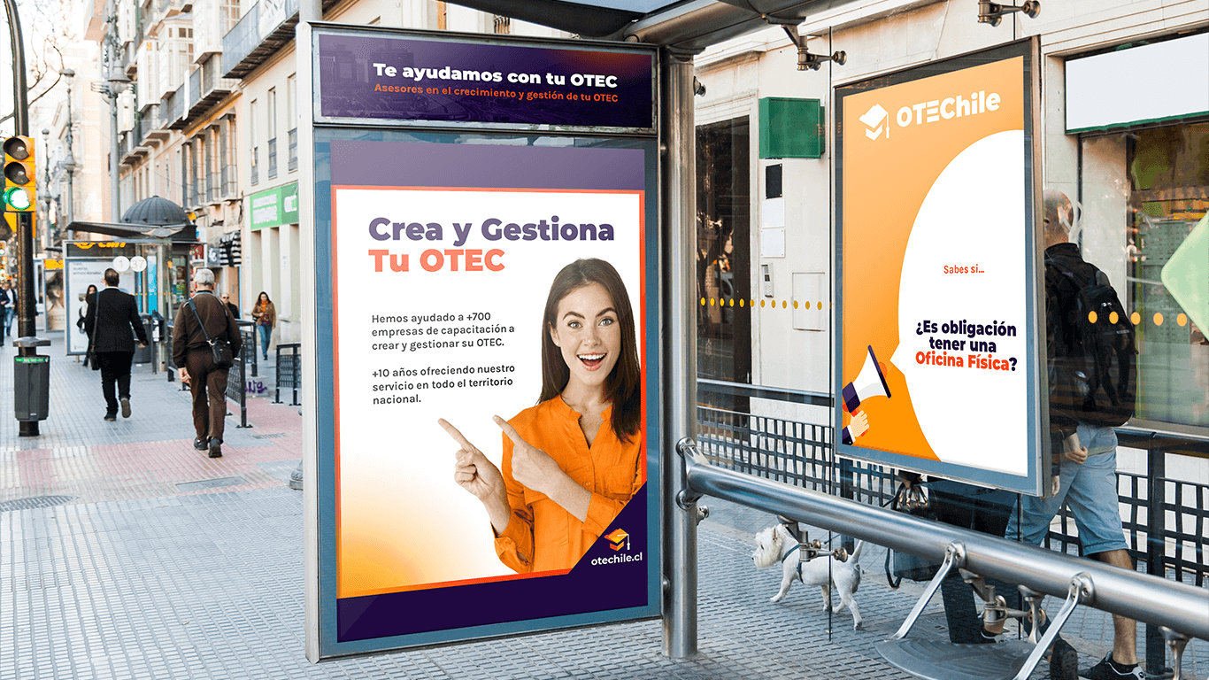
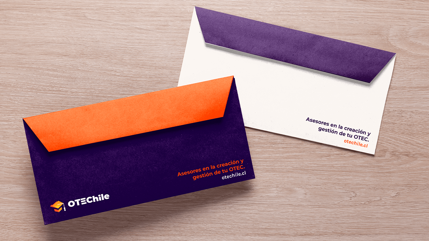
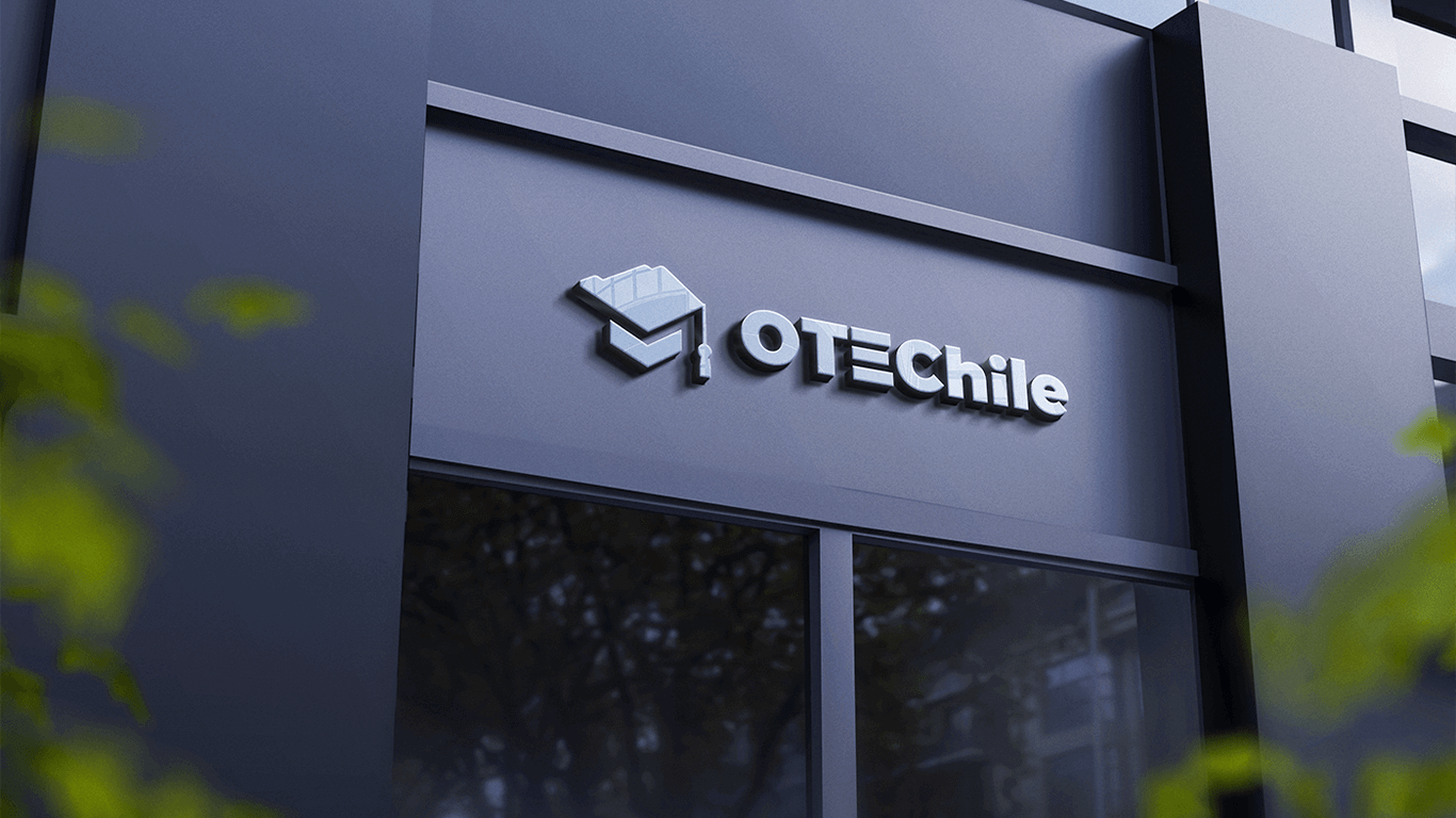
The Scope: Logo, Brand Voice, Typography, Color, Hierarchy, Print Collaterals, Brochures, and Design for Socials.

After an interview with the founders, we built a Buyer Persona. This allowed us to do a more efficient job of appealing to OTEChile main clients: Training Agencies.
While we were developing their brand and going through the research phase, we presented the team a Stylescape. They assist the client in imagining what their brand identity could possibly be like.
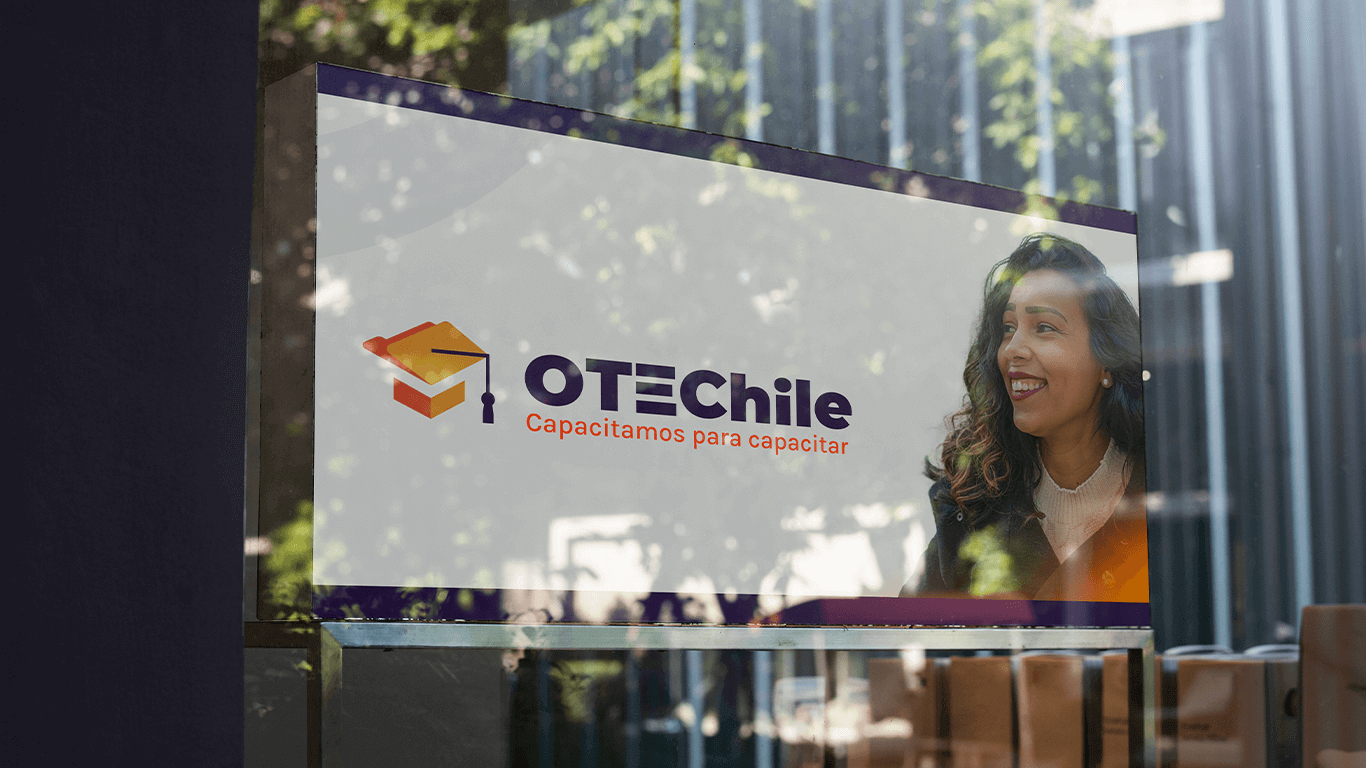
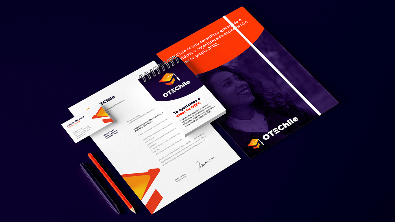
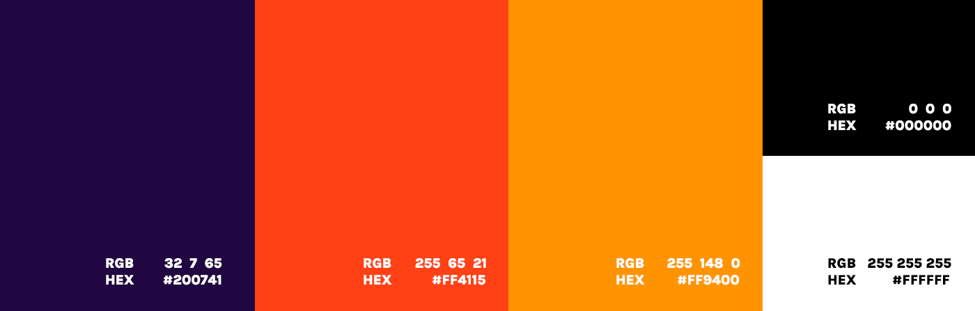
We chose Orange and Plum as the main colors. OTEChile used Orange and Blue for 10 years. But we wanted to make a differentiation between their competitors. Keeping the “Knowledge, Academic & Professional” Aura of the brand.
For typography, Founders wanted to use Google Fonts. For Titles, Montserrat Font was selected. And for text, Karla Font. Keeping the easy to read San Serif style.

Project expertise:
Logo System, Brand Voice, Typography, Color, Hierarchy, Print Collaterals, Brochures, and Design for Socials, visual identity, and graphic guidelines.
Type of client:
Consulting Agency in the education and e-learning sector. B2B: Trainning agencies, universities, academies and digital services companies.
Amplify your ROI with a Powerful Custom Brand

Nh4utilus is a full-service digital creative agency. Attract, Impress, and Convert more leads online and get results with Nh4utilus.